Demo store, fictional No client, no real audit. Built to show how we work.
Case study (demo): 30 Shopify theme accessibility issues, fixed
Kettlecrest Outfitters is a fictional storefront we built to show how we work. We seeded it with defect types common on real Shopify stores, wrote a 30-issue mock review against WCAG 2.2 Level AA, and fixed every issue on a duplicate theme.
- Store
- Kettlecrest Outfitters (fictional)
- Theme
- “Basecamp” v2.3, a fictional Shopify-style theme
- Review
- Mock review, 30 issues: 7 critical, 15 high, 7 medium, 1 low
- Target
- WCAG 2.2 Level AA
- Templates
- Home, collection, product, in 8 page states
- Widths
- Desktop 1280 px, mobile 390 px
- Where
- On a duplicate. The original was never changed.
Results
axe-core rules violated
Before: 12After: 0
659 affected elements before, 0 after, over 16 scans
Scripted retest per issue
Before: 0/30After: 30/30
One keyboard and accessibility-tree check per issue
Keyboard-only shopping task
Before: FailAfter: Pass
11 of 12 steps failed before; 12 of 12 pass after
Lighthouse accessibility
Before: 43–52After: 100
Home, collection and product, desktop
The before store is a deliberately dense mix of common defect types; real stores usually show fewer automated failures but the same manual-only ones.
What the review found
Axe flagged 13 of the 30 issues. The other 17 needed keyboard and screen reader testing.
By category
We pressed Tab through the product page
Demo store, fictional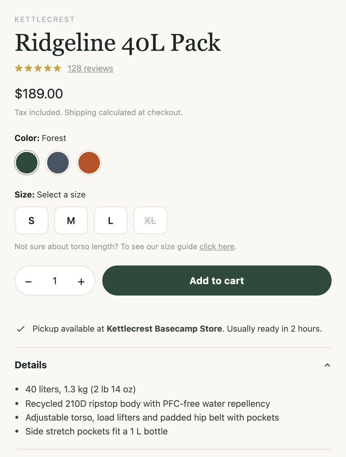
Focus jumps past color and size.
Where focus landed
- 12 Link “128 reviews”
- 13 Link “click here”, after jumping past color and size
- 14 Quantity field, with no label
- 15 Add to cart, which then fails: no size selected
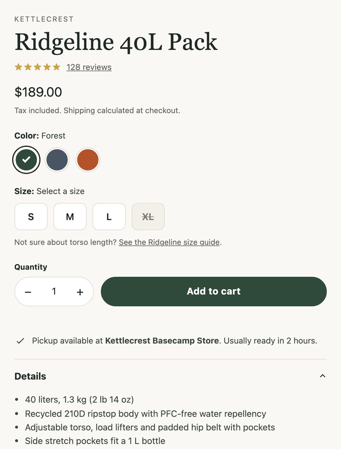
Every control is a tab stop.
Where focus landed
- 18 Link “128 reviews”
- 19 Color group, radio “Forest”, checked
- 20 Size group, radio “S”
- 21 Link “See the Ridgeline size guide”
- 22 Button “Decrease quantity”
- 23 Field “Quantity”
- 24 Button “Increase quantity”
- 25 Button “Add to cart”
- 26 Details disclosure
Recorded with Playwright at 1280 × 900: Tab pressed from the top of the page, newsletter popup dismissed first on both versions.
What we changed
Ten groups of fixes, each mapped to its issue IDs in the change log.
Color and size pickers
Issue IDs:
KC-009KC-018Clickable
<div>s rebuilt as native radio groups; checked state shown with ring + checkmark; sold-out size disabled and named.Popup, cart drawer and search
Issue IDs:
KC-013KC-014KC-022Native modal
<dialog>s: focus moves in, Escape closes, real close buttons, focus returns to the opener.Add-to-cart feedback and errors
Issue IDs:
KC-015KC-025Focus lands on a visible “Added to your cart…” confirmation (also the dialog description); errors use
role="alert"and are linked to fields.Visible focus
Issue IDs:
KC-007KC-008KC-011Global outline reset removed; two-tone
:focus-visiblering; no more invisible focus on hidden slides or quick-add buttons.Mega menu and carousel
Issue IDs:
KC-010KC-012APG disclosure menu (button,
aria-expanded, Escape); APG carousel with visible pause and no autoplay under reduced motion.Names for controls and links
Issue IDs:
KC-002KC-008KC-028Icon-only buttons and links named (“Search”, “Cart, 2 items”, “Quick add … to cart”); “click here” links rewritten.
Forms
Issue IDs:
KC-017KC-020KC-024KC-026KC-029Visible labels instead of placeholders, autocomplete, linked and announced errors, native filter checkboxes, labelled sort and quantity.
Page structure
Issue IDs:
KC-001KC-004KC-019KC-023lang, zoom re-enabled, skip link, landmarks, one h1 per page and ordered headings, with the same visual design.
Images and ratings
Issue IDs:
KC-003KC-021KC-030Real alt text (empty where decorative); gallery alt follows color and view; ratings read “Rated 4.6 out of 5”.
Contrast
Issue IDs:
KC-005KC-006KC-027Theme color tokens adjusted to 4.5:1, scrim behind hero text, review-app colors overridden.
Two of the diffs
Straight from the demo’s fix.diff. On a real Shopify theme, the same changes land in the files named in brackets in the change log.
*, *::before, *::after { box-sizing: border-box; }- *:focus { outline: none; }- a:focus, button:focus, input:focus, select:focus, textarea:focus { outline: none; }+ /* KC-007: visible, two-tone focus indicator */+ :focus-visible {+ outline: 3px solid var(--focus);+ outline-offset: 2px;+ box-shadow: 0 0 0 5px #fff;+ }- <div class="cart-overlay"></div>- <div class="cart-drawer" data-qa="cart-drawer">+ <dialog class="cart-drawer" id="cart-drawer" aria-labelledby="cart-title"> <div class="cart-head">- <div class="cart-title">Your cart</div>- <span class="cart-close"><svg …></span>+ <h2 class="cart-title" id="cart-title" tabindex="-1">Your cart</h2>+ <button type="button" class="cart-close"><svg aria-hidden="true" …>+ <span class="visually-hidden">Close cart</span></button>+ <p class="visually-hidden" role="status" id="cart-live"></p>The keyboard-only shopping task
Dismiss the first-visit popup, open the Ridgeline 40L Pack, choose Slate and size L, add to cart, check the cart drawer takes focus and announces the add, close it with Escape, focus returns.
| Step | Before | After |
|---|---|---|
| Popup moves keyboard focus into itself | Fail | Pass |
| Tab keeps focus inside the popup | Fail | Pass |
| Escape closes the popup | Fail | Pass |
| Reach the product link with Tab | Pass, focus not visible | Pass |
| Choose color “Slate” with the keyboard | Fail | Pass |
| Choose size “L” with the keyboard | Fail | Pass |
| Add to cart with Enter | Fail | Pass |
| Cart drawer opens and receives focus | Fail | Pass |
| The add is exposed to screen readers | Fail | Pass |
| Escape closes the cart drawer | Fail | Pass |
| Focus returns to “Add to cart” | Fail | Pass |
| Visible focus on every control used | Fail | Pass |
What a screen reader heard on Add to cart
- (nothing announced)
- button, Add to cart
- dialog, Your cart, Added to your cart: Ridgeline 40L Pack, Slate / L. Cart has 1 item.
- heading, Your cart, level 2
Virtual screen reader transcript (not VoiceOver). On every project we test with VoiceOver and NVDA.
What you’d get on a real project
- A change log entry for every issue: criterion, files changed, what changed, how we verified it.
- Changes on a duplicate or staging theme only. Your live theme stays untouched until you approve.
- Before/after scan results at desktop and mobile widths, mapped to your issue IDs, with keyboard and screen reader notes.
See what your store needs
Book a Review with full manual testing, or compare packages and prices first.